Flynn Companies
Commercial Construction — North America
Flynn operates across 35 locations with three distinct service lines — roofing, glazing, and cladding. Their existing site buried everything inside dense copy and made it nearly impossible for a prospect to understand what Flynn actually did without reading for ten minutes. Leadership wanted a site that communicated scale and authority within seconds of landing.
A video-driven homepage with bold service segmentation and a clear navigation structure built for both general contractors and facility managers. We stripped the copy down, let the project photography do the heavy lifting, and added a location-aware contact flow to route leads to the right regional team automatically.
Belleville Electric
Electrical Contractor — Before & After
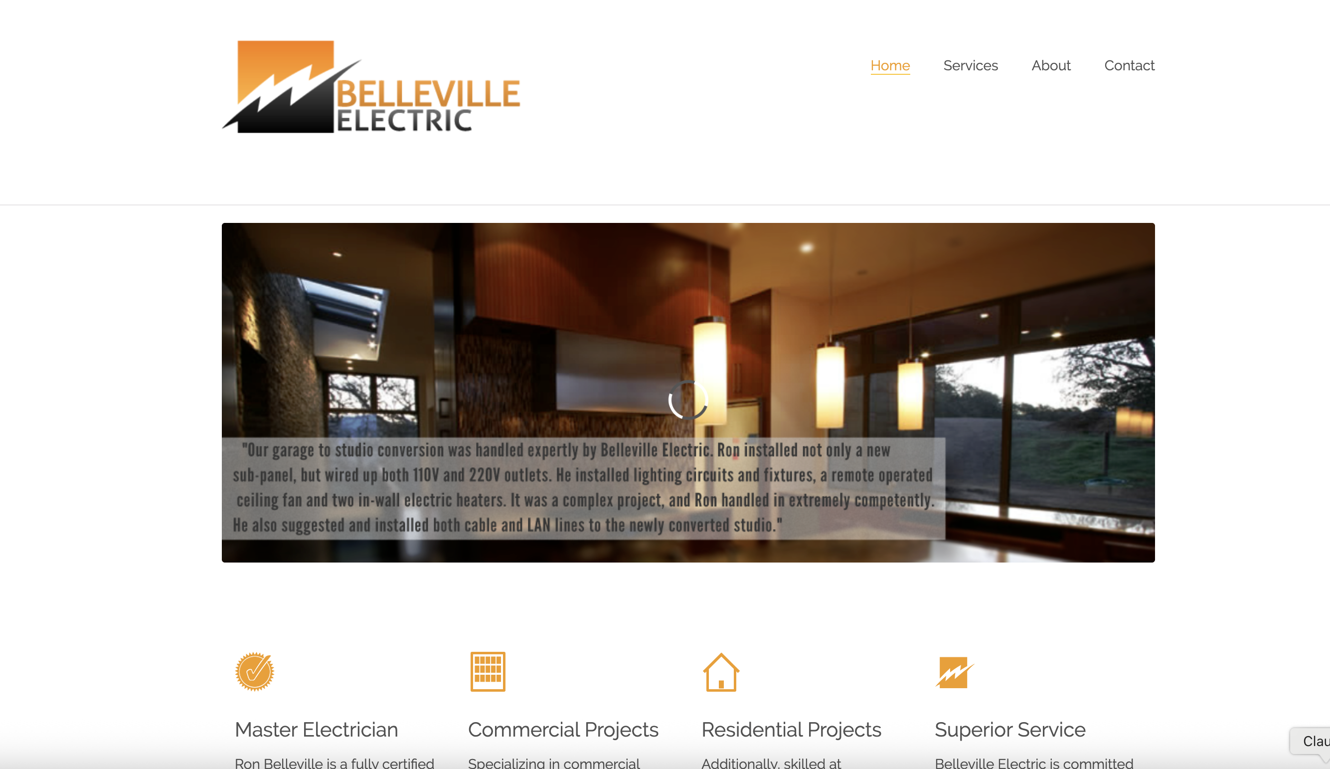
Belleville had been running the same site for years — a basic template with generic stock photography, no clear call-to-action above the fold, and a contact form buried three scrolls deep. They were getting traffic from Google but losing leads to competitors who simply looked more professional online, even when Belleville's actual work was stronger.
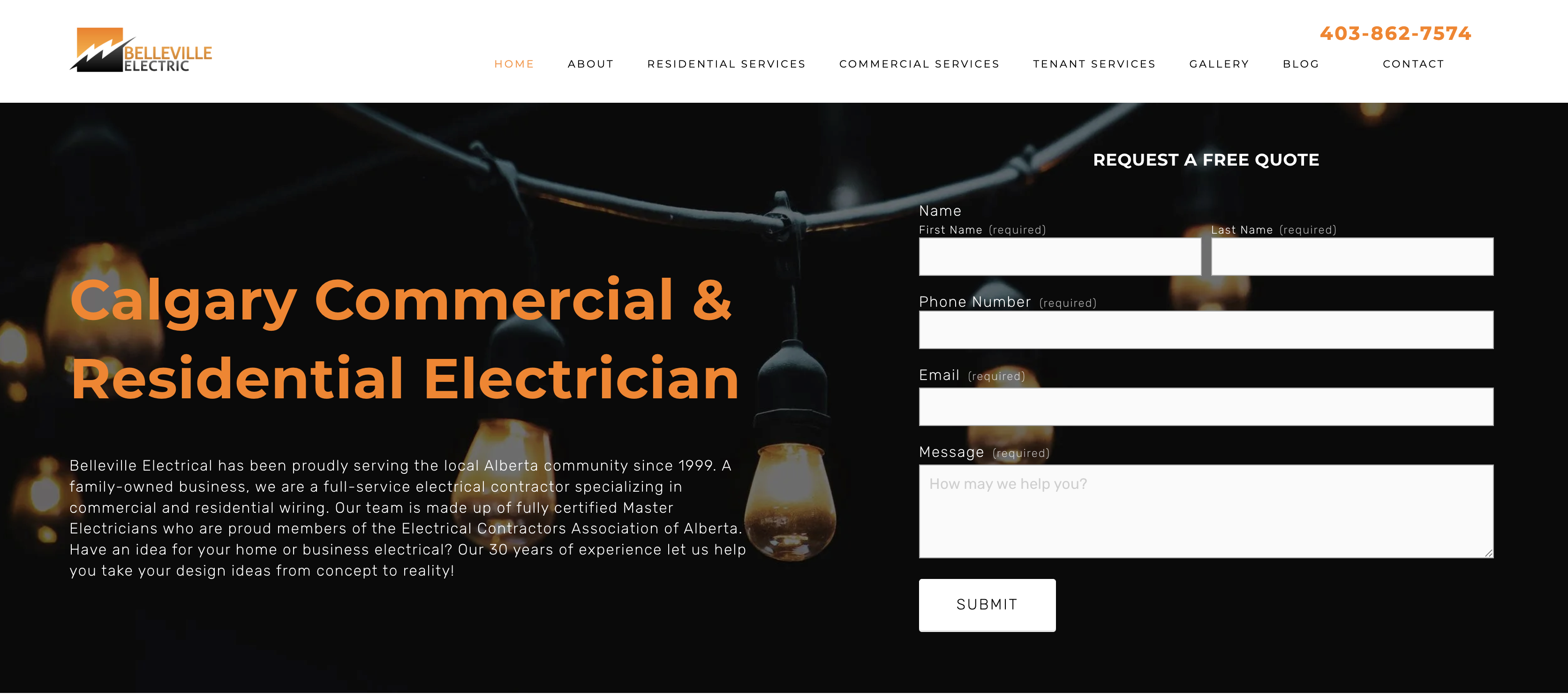
A full redesign built around trust and conversion. Dark, high-contrast homepage with the phone number top-right, a quote request form above the fold, and a location-specific headline built for local SEO. Service pages were restructured to speak separately to residential and commercial buyers. The result looked like a company that had been doing this for 25 years — because they had.
Ma'Ono Fried Chicken
Restaurant — Seattle, WA
Ma'Ono had built a serious reputation in Seattle — weekend waits, a loyal local following, and a strong brand people already recognized. But the website needed to feel as memorable as the restaurant itself. It had to showcase the food, reinforce the brand, and make ordering, location discovery, and menu browsing feel effortless instead of scattered.
A brand-forward restaurant experience built around strong visuals, oversized typography, and a simple user flow. We kept the navigation focused, gave the site more personality, and made the path to menu viewing and online ordering far clearer. The result feels more like the restaurant people know in real life and less like a placeholder website assembled between lunch shifts.